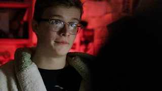
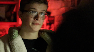
Looking back upon my footage from I really liked the way that the blue from the screen in the shot below contrasted with the red lights in the background. The highlights of the frame were cool toned, and the shadows were red.
I therefore used this as a basis for as many shots as possible in this scene: making the highlights cooler, and saturating the shadows. You can see this in the colour board screenshot from final cut below.
Here you can see the difference between the original and the edited version.
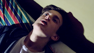
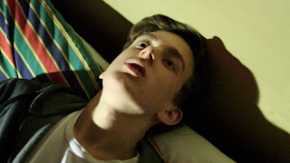
Here you can see the difference between the original and the edited version.
EDITED ORIGINAL
