This is a press explaining the important features of my magazine construction. Many of the decisions I have made have been influenced by my research on Little White Lies Issue 71, which you can see in my previous post.
Thursday, 14 December 2017
Little White Lies: Magazine article details
This press shows details from Issue 71 of LWL, featuring the film Call Me By Your Name. These important details are things I want to use in my own magazine double spread.
Making two poster options
These were drafts of the two options:
The above poster is a draft of version, which includes 9 different photos. It allows for variety but means that the text is slightly closer together.
This is a draft of version two, with rows of the same photo, which means there are only 4 different photos included. This is closer to the layout of some prints that use the same photos in rows. It also means that the text can spread out more.
After editing fonts, adding the film festival and the lorel wreaths, these were the final two options:
Photos for the new poster
These are the original photos that I am going to use for my poster. I took them against a simple white background, and tried to use similar framing to a photobooth. By taking my own photos it also meant that i could have more options for poses, so the actors could just have fun and be silly like they would in a normal photobooth.
I took one image of Izzy by herself, like the photo she would have taken by herself in the final scene. She wears the same dress and makeup as she did for this scene. When put side by side by the images of them together, it immediately shows that something in the relationship is wrong, especially as she is in a different costume and isn't smiling at the camera.
poster trial with film stills
These were two poster options I thought about using stills from the film. The top is my favourite, and the bottom version I experimented with but didn't think was very striking, though linked more to the title of the film.
Poster research/influences
In order to construct my poster, I researched into posters for other short films that I liked so I could not only understand the crucial features of a poster, but also what differentiates a poster for a short film to a poster of a feature film.
I began with the posters made for Bertie Gilbert's short films. For most of his short films, he has a very similar layout, and uses stills from the films rather than separate press photographs.
I liked that for Let It Be the font is flipped sideways, which is something that personally I see very rarely.
For Rocks That Bleed, I loved that he used stills from the film that had some movement in it: it makes the viewer quite uneasy, especially when coupled with shots drowned in red. It means that the font really stands out against the movement.
In his posters, he usually just includes the title, the billing block, release date, and 'A Bertie Gilbert Film'. For the second poster, he includes a film festival award with the laurel wreaths surrounding the text, and the names of featured actors in the short film.
Below is the poster for Wes Anderson's Hotel Chevalier.
This short film was a prequel to his feature film The Darjeeling Limited, so it was released alongside it at cinemas. As it wasn't marketed in the same way as his feature films do, the poser is naturally much more paired back. I still felt that this was relevant for my research as it thought that this is a beautiful photograph, and frames the actors well, is edited with a grain effect that reflects the classic style of the Paris landscape, and the colours are really striking. For my poster I want more detail on release dates etc., but I still really liked the way this poster was put together.
Below is the poster for The Darjeeling Limited. This is most likely not the main version of the poster that was used in advertising, but is again a much more paired down version, similar to how you would market it if it were a short film. I particularly liked how they used the brown frame and featured the film festival awards.
This is the poster for Mahalia Belo's 'Volume'. This is an incredibly strong still from the short film, and I really like how they have positioned the film festival awards and the film title.
The structure for my poster will be most similar to the Rock That Bleed poster, as I am keen to include lots of detail on the cast, film festival awards and a billing block, without overwhelming the poster. I will not include a tagline that is frequently used in feature film posters, as after my research I can see that this is very rarely, if ever, used for a short film poster.
Friday, 8 December 2017
Rough Cut 4
This rough cut includes some of the tracks from the soundtrack that has been composed by Eliza.
Thursday, 30 November 2017
Scene 4 colour correcting
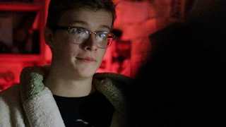
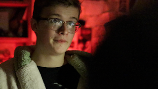
Looking back upon my footage from I really liked the way that the blue from the screen in the shot below contrasted with the red lights in the background. The highlights of the frame were cool toned, and the shadows were red.
I therefore used this as a basis for as many shots as possible in this scene: making the highlights cooler, and saturating the shadows. You can see this in the colour board screenshot from final cut below.
Here you can see the difference between the original and the edited version.
Here you can see the difference between the original and the edited version.
EDITED ORIGINAL


Scene 3 Colour editing
I filmed this scene with a 'white light' setting for white balance on the Canon 80d, as I knew I wanted to have a stark contrast between the fifth scene that I had already filmed. These original clips from scene 5 were very cool toned, which was exactly the effect I wanted, but I didn't want to repeat this for scene 3.
When looking back at the footage, as you can see below, the shots looked very overexposed, but did have a pinkish quality that I really liked, almost like you were looking at the scene through rose tinted glasses. Therefore I edited all of the shots to look warmer, slightly darker, but still maintain the pink tones.
EDITED ORIGINAL
Soundtrack development
We have had many long conversations about the atmosphere of each scene and how the music can support it, and we have both suggested existing soundtracks that we think would fit the tone of the film and we would like to use as a basis upon which we can develop the themes.
I specified that I wanted a theme during the flashback scene for Jack and Rachel that returns at the end in piano, and showed her my soundtrack tests video with other specific ideas and my original soundtrack blog post which included clips from Manual Cinema.
Below is the document that Eliza initially created with two different options for the soundtrack. It is incredibly detailed and includes a developed list of existing soundtrack influences and precise moments from the second rough cut where the soundtrack will change, or fade in and out.


Poster tests
Instead I pursued the idea of using the photo that we took at the photobooth in the station and replacing the text on the photo with the film title and billing block, etc.
Unfortunately, as you can see below, it was really difficult to get a photo of it! In person the quality is really good, but this doesn't translate on camera. I also tried scanning it into the computer (which you can see in the black and white photos) but these also didn't really work.
I think now I will instead make it 'manually', and take photos of both of Izzy and Roddy on a white background and create the same look of the photobooth strip.


Soundtrack tests
This video about 'How Pixar uses Music to make you Cry' really struck a chord with me: it helped to emphasise the importance of establishing themes and how can have great emotional significance when used again at another point in the film.
I therefore used this premise as a basis upon which I could build my own soundtrack.
I wanted to:
- establish a theme during the flashback scene (scene 3)
- return to that theme, paired down to just the piano, in the last scene when Rachel announces she's leaving, and walks away (scene 5).
In addition to this, I also used the American Beauty tracks as suggested in my earlier Soundtrack post and my animatic. In the soundtrack I would also like:
- Hopeful music for the moment that Alfie tells Jack that Rachel isn't worth his time. I want this to feel like a 'realisation' moment.
- Swelling music, reminiscent of the Jack and Rachel theme (but not the theme in its entirety), for when he sees her at the photobooth again (scene 5)
Below is the video I made with the soundtrack tests.
Monday, 27 November 2017
Rough cut 2
In this second rough cut I have added in the diegetic sound from the external microphone, which as you can hear makes a huge difference.
There are some problems I have encountered with sound. Firstly, for the flashback scene outside the train station, the external microphone picked up a lot of sounds from the windy weather. Therefore I have chosen to work with the sound on the camera, which i think is actually more successful. This just means that from now on I have to be careful when cutting between shot-reverse-shots to ensure speech doesn't get cut off. There is also one shot in the final scene that I do not have diegetic sound for, so for the moment i have kept in the sound from camera and will re-record the line of dialogue I need soon.
While working through my second rough cut, I got some audience feedback from those in my class:
- Obviously, sound needs to be finished. As there is a mixture of locations and changing between sound on the camera and sound from the external mic, so that needs to be sorted
- the cinematography is really strong
- There are pauses in dialogue/ shots that can be shortened
- The beginning shot with the old camera was very successful and works well when setting the tone
Things I need to do/change:
- Re-record Liam's line of dialogue that was missed in the final scene
- Check sound levels throughout the film, that one line in the scene isn't dramatically louder than another
- Edit the colours/exposure for the flashback scene and the scene in the dark room
- I accidentally added in the sound from the camera as well as the external microphone. I need to take this out and just have the ext. mic. sound.
- re-edit the flashback scene, we don't see Jack turn to face Rachel, which doesn't make sense. I need to use a different take when Jack does turn round instead.
- Shorter gaps between dialogue in flashback, more snappy
- Make sure the background noise flows under the dialogue in the final scene and the dark room scene
- re-edit the final shot of Rachel so that the focus is smooth
Rough cut 1
Here is the first rough cut of my short film. This is only using the sound from the camera, but the shots are all in order which gives me an idea of how the film now looks and feels.
I'm really happy with how it looks overall, I think the dialogue flows well and the storyline follows through. The colour and lighting really helps to distinguish between different periods in their relationship, and I'm so happy with the acting performances throughout.
- Add in diegetic sound from external microphone
- Tighten up the editing; shorten some of the shots and gaps within dialogue
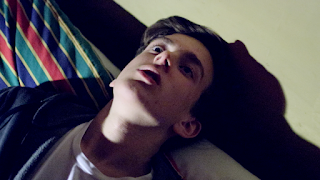
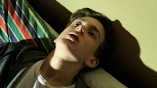
- re-edit the scene with Jack and Alfie, when Alfie gets up and lies down on the bed, and use the shot when he sits up again
Filming with the old camera
We found an old camera in the Media Studies department at school that had been used by students many years ago, that I thought would be ideal to use for the opening shot of the film instead of filming onto DSLR and degrading the quality in post-production.
I was really excited to use this old camera as it was exactly the quality and atmosphere that I wanted for the opening. However, it came with a few challenges as using this old camera I couldn't film onto a memory card, I had to record onto a video tape. This is a short video I made explaining the process of using the camera and getting the footage afterwards.
I was really excited to use this old camera as it was exactly the quality and atmosphere that I wanted for the opening. However, it came with a few challenges as using this old camera I couldn't film onto a memory card, I had to record onto a video tape. This is a short video I made explaining the process of using the camera and getting the footage afterwards.
Thursday, 16 November 2017
Filming schedule v.2
Here is the updated film schedule.
When filming on October 25th, we only ended up filming scenes 2 and 5 and as everyone was limited for time that morning, we decided that instead of pressurising ourselves that day that we would film scene three two weeks later. This actually worked really well as we weren't panicked for time and my friend Alice was able to help with the sound.
We also had problems with filming at Jonah's house on Sunday 29th, so we also rescheduled for 1st November.
Subscribe to:
Posts (Atom)


