Monday, 31 October 2016

Vertigo Opening


This is the first scene from Hitchcock's 1958 classic thriller.

Camerawork
  • The opening shot fades in from black and we see what seems to be a pole, and then two hands grab onto it. The camera moves out to reveal the pole is part of a ladder on the side of the building, so the man climbs up it and then runs past camera. Behind him, two men, one in a police officer's uniform and the other in civilian clothes, also climb up the ladder one after the other.
  • Next is a wide shot used to show the rooftops of the city at night, and the camera pans and follows the rooftop chase, with the policeman occasionally firing a shot from his gun.
  • After this is a mid-shot of the first man jumping over something and clinging onto another rooftop, and subsequently climbing over it. The police man follows him, but the third man fails to cling on, and a closer in mid-shot shows him falling, and another of him catching the drain pipe. A close-up shows his realisation that he is stuck.
  • A close-up shows the policeman going to help the man who fell, and we cut back to a close-up to see that man looking down at the ground. The next shot is a long who looking down at the ground, and the camera zooms out so it looks like the distance is getting bigger and bigger. This imagery helps us to understand the vertigo that he's experiencing.
  • We cut to and from a close-up of the man looking down in terror, and then at the ground beneath him. The policeman turns back to try and rescue him, and the camera looks up towards him on the the roof, so this could be the man's POV. In one shot the camera looks down at the man hanging off the drain, with the open framing and the ground beneath him, and the hand of the policeman reaching out to him.
  •  Subsequently the policeman falls off the roof, and in two shots we see him slip down in a mid-shot showing the roof and the man hanging, and then fall past the man in a close-up. The policeman falls to his death, and the camera looks down to the ground in the same wide angle as before, again this being the man's POV. Here we can see what he sees, and we are more empathetic towards the shock he is experiencing.
  • We cut to a close-up of the man looking down at the ground. The the same wide angle of the ground, the man sprawled on the floor with people running towards him.
Lighting and Colour
  • The lighting is very low-key throughout as it is set at night, so there are lots shadows cast across faces and dark areas of the city behind them, or parts of the streets beneath them that are unlit. This creates a sense of mystery, we question what could be hiding in the shadows, makes the chase much more dangerous as it is set at night.
  • On the rooftop from which the policeman falls, warm lights shine onto the roof, lighting the men from behind. When we see the close-up of the man dangling from the drain he is warmly lit from above. This casts strong shadows across his face. 
  • The colour in the scene is mainly quite cold, and this is due to the clear, deep blue night sky behind them. However, lights used in the scene are slightly warm, but this imitates the colours of street lamps at night. 
Editing
  • Other than the fade at the beginning, there are only straight cuts and continuity editing. 
  • At the beginning the editing is very slow-paced, but when the man begins to slip off the roof the scene jumps back and forth between shots to help build to the climax.
  • At the end after the policeman falls there is low-speed editing, which is really dramatic as we watch the man look down in fear, and then see his POV of people rushing ti the policeman dead on the road.
Sound

  • The non-diegetic soundtrack is orchestral, with lots of stings and brassy instruments. The piece really helps to drive the scene on and keep tension high.
  • There is sound of the men climbing across the roof, and the gun shots in that first wide shot that stretches across the rooftops of the city, but they are much quieter in comparison to the soundtrack. 
  • In the music there are high, brassy notes when we look down at the ground before the policeman falls, which helps to show the fear that he feels when he looks at the ground too.
  • The music settles after the policeman falls, so after the climax of the scene the music is deep and dramatic.  
Mise-en-scene
  • It is clear that the first man in the scene must be a criminal as we see the policeman chasing after him, but it is unclear way the man in the civilian clothing is involved in the the chase too as of yet. 
  • The policeman turns to help the man hanging from the drain, which shows where his priorities lie, and that he must be quite kind to offer to help instead of catching the criminal.
  • All of the camerawork, sound, lighting and editing really help to emphasise that this is a moment that has really shaken the man, and this is enough for him to realise that he definitely suffers from vertigo. 

Sunday, 30 October 2016

Silence of the Lambs Opening

Camerawork


  • The opening shot in the clip is a close-up on Clarice Starling, and then a mid-shot of her running through a forest while the camera follows her. This already creates quite a sinister mood, the classic thriller shot of an innocent woman running through the woods, the audience right behind.
  • We see her approach a large net made of rope that you can climb up, move to the other side of at the top and then climb down the opposite way, much like an obstacle course. The camera pans round and tracks her movement across the equipment. The ease of her movement and the steadiness of the camera seems very comfortable, like she's done this many times before. the camera stays still and we watch her run into the distance.
  • All in the same shot, someone shouts her name off camera, but addresses her as 'Starling', and as the man who called her name runs into shot and towards her, the camera also moves in. As Clarice leaves, the man turns to camera, and the close-up on him reveals he is a member or the FBI, labeled on his cap.
  • The next shot it a close-up of a tree, and the camera tips down to reveal an FBI mantra that must be taught in training- 'Hurt, Agony, Pain, Love--It'. This shows the sort of message that Clarice has been exposed to throughout her career, and what part of her character must be like. As the camera stops to tilt, Clarice runs closer to the camera and around towards the FBI offices. She is surrounded by late groups of people in training.
  • A wide shot next shows a glass bridge between two buildings, and the camera zooms in so we just catch Clarice running through the bridge. 
  • The camera follows Clarice through sets of corridors and her walking through a workshop, showing her in her normal, working environment. 
  • One of the final shots in the first two minutes shows Clarice walking along another corridor into a lift full of men dressed in red. I think that the fact that she seems so comfortable in this setting says a lot about the environment she's used to.
Editing
  • The editing is very simple, and uses straight cuts and continuity editing throughout the opening.
  • It's quite low-speed editing, so nothing is too intense, and we can fully take in the setting of the story.
  • The titles in the opening sequence are very bold and outlandish. I have to say that these nearly overpowered each shot, as you couldn't always see the action going on behind it. This may also be why they used slow-paced editing, so we had a chance to see what's going behind the titles.
Lighting and Colour
  • The colours are quite dull throughout the opening scene. the forest, the buildings, the corridors, even her clothing is very monochrome. It makes the her training at the moment seem to not be very exciting, and so her new assignment would be an interesting change for her. 
  • Outside the lighting is very natural, but inside there is harsh strip lighting, which further emphasises the dull feeling of her training thus far. 

Sound
  • One of the first things I noticed about the opening is the bold orchestral soundtrack. At the very beginning it is in a minor key, which send very dramatic at first, but after she the FBI base comes into frame the music suddenly becomes major, and much more uplifted. This contrast between the sinister minor strings and the happier major key shows that she finds comfort surrounded by her work, and people similar to her. Essentially, alone, she is more susceptible to danger. 


Mise-en-scene

  • We learn a lot about Clarice from this opening. The camerawork is cleverly ordered so we gradually see that she is part of the FBI. As she isn't with anyone else, she must be doing this training course in her spare time, which shows she works diligently. She climbs the apparatus with ease, so clearly she has done this many times before.When she enters the FBI buildings, she is recognised by a couple of people, so she must be liked amongst her colleagues. 
  • At the end of the opening she walks into a lift surrounded by men significantly taller than her, and her grey jumper standing out from their red uniforms. She doesn't look uncomfortable in this situation, so clearly she is accustomed to an environment lead by men. This will probably give her an advantage in her work, as she is one of very few women in her workplace. 


Rear Window Opening

Camerawork


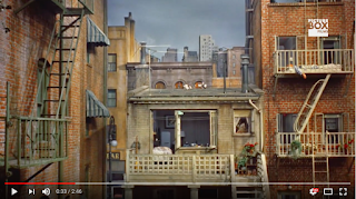
  • The opening shot is framed by a window, and then the camera moves forward to look outside the window. We can see a courtyard surrounded by apartments, and windows looking through into each one.
  • The next shot looks down on a neighbourhood cat, and then tilts up to look at the blocks of apartments. The camera moves very slowly and tilts and pans over and across the apartments, and finally pans so the camera goes back through a window to close-up up on a man lying back, with sweat dripping down his forehead. This long wide shot establishes the setting of the story, of what is seemingly a very normal area. 
  • It cuts to a close-up of a thermometer to show the temperature, and then pans across and changes focus to see a man getting shaving in his apartment in the distance. The fact that we can see through completely into his apartment shows how easily neighbours must be able to as well. 
  • We then see a couple waking up on the balcony of their apartment, again another long shot. When we see the neighbours we never see a close-up, we only look at them from a distance, but when we see the man sweating in the chair we see a close-up, so he must be important. 
  • In the same shot, the camera tilts and pans to another building, an a young woman is getting changed by the window. As the camera pans away, it takes the same route as before- panning across the buildings and then into the apartment of the man in the chair, but this time the route taken by the camera is closer in. 
  • In the same shot, the camera tilts down the man in the apartment, so we can see that he has broken his leg, and then pans to a broken camera, and then to a photo of a racing car on his wall. Much like how a montage would work, this long shot looks around the room as you would if you had just walked into it, and leaves the audience to piece together the evidence, you could say. We later discover he is a photographer who broke his leg in a racetrack accident.
Editing

  • The editing is very simplistic, Hitchcock uses straight cuts, but low-speed editing so the audience can fully take in the setting.
Lighting and Colour
  • The lighting is also very simple and natural. It is high key, with lots of light filling the court outside the rear window, so we can fully see into each apartment. Again, his simplicity makes highlights the seemingly normal set up. 
  • The colour is all uniform throughout the opening, so there is nothing out of the ordinary or dramatic that particularly draws our attention.
Sound
  • At the beginning, to me the music is contrapuntal because it is so orchestral, brassy, with lots of percussion, which seem too exaggerated for slow-paced sequence. However, as this soundtrack continues, there is more of a sense of mystery to the music. 
  • When we see the man shaving in the window, the music stops and then a radio advert is heard from his apartment. He changes the channels to some music that plays underneath the rest of the opening. This music is sounds a bit more cheeky and inquisitive, which reflects the fact that we are literally spying on the neighbours. 
  • The alarm clock from the neighbours sleeping on their balcony is very loud, which mirrors the idea that the each person's business has the capability of being everyone's business.


Mise-en-scene
  • From this opening we get a clear sense that everyone can see into what your are up to, so there is very little privacy, and yet the neighbours don't seem to notice this, one woman is even getting into her bra in front of the window. 
  • The man in the wheelchair is clearly a main character, who must be quite a daredevil if he has broken a camera in such a drastic way. Confined to the wheelchair, the view out of his rear window must be something to keep him occupied during the day. 
  • Hitchcock was great at creating a very normal scene for an opening. Even though it's a bit strange that you can easily look into each other windows, the scene looks like an everyday situation on a hot summer's day. Using this as an opening, Hitchcock could use a slow-build of intensity, and gradually introduce odd or intriguing elements into the storyline. 

Shutter Island Opening

Camerawork
  • The scene opens with a wide shot of the boat emerging from the mist by the sea. The wide helps the reveal of the boat to be really dramatic and ghostly.
  • We cut to a mid shot of Teddy being sit in a toilet. We can't see his face, but we see his figure in the bathroom. The camera tilts up and down very slightly to create the effect of a boat on the sea, causing Teddy to feel very seasick.
  • The next shot is a over the shoulder close-up of Teddy looking at himself in the mirror, insisting he must 'pull [him]self together'. As we see two of Teddy in one shot it implies split personality.
  • When Teddy looks out of the mirror, the closed framing of the close-up really helps us to empathise with his claustrophobia in the boat. 
  • Teddy washes his hands in the camera looks down at his hands, and then quickly tilts up to a close-up of his face. The fast tilt mirrors the feeling of being seasick as the boat is rocking back and forth. Teddy breaks the fourth wall here, and we feel like he is addressing us, almost acknowledging his fictionality, as you may do in a play. This is a clue into the reveal at the end of the film about our perception of the reality.
  • There is a wide shot of Teddy walking through the sheltered level of the boat, and large claw-like equipment is hanging from the ceiling. The camera changes focus between this equipment and Teddy, and these being in close proximity to Teddy, swinging as the boat sways, makes us feel quite uncomfortable.
  • We are first introduced to Chuck, Teddy's colleague, by a mid shot looking through a metal cage, ceasing a feeling of separation between the Teddy and Chuck, perhaps showing he's difficult to read or get through to. It also reflects the hidden reason for Chuck being here, and what he keeps from Teddy.
  • Dialogue between Teddy and Chuck is shown through mid shots, most with the open framing and the sea going on 'forever' behind them. It shows further how they're just surrounded with water- Teddy's worst nightmare.
  • When Chuck asks whether Teddy has 'a girl', is it accompanied by a close-up, with Chuck in frame but the full focus on Teddy. Through this we see how uncomfortable he is when discussing his wife.
  • cross-cut to a flashback of Teddy's wife; first we see Teddy's wife and then the camera pans as we see Teddy doing up his shirt. There's a closeup of his wife's bare feet standing by Teddy, which shows how close they must have been. 
  • Close-up on Teddy when he simply adds, 'she died'. We see how upset but also how in control he is of his emotions from this shot. He dismisses any sympathy by simply saying, 'don't worry about it,' which is a bold contrast to his attitude to his wife's death later on in the film.
Editing
  • The editing style is quite simplistic, with straight cuts and continuity, but not in the flashbacks.
  • When we cross-cut to the flashback, we see a record playing, then quickly cut to a zoom on Dolores (his wife) and then cuts to a still close-up of Dolores. The high-speed editing and awkward cuts reflect the warped nature of Teddy's flashbacks.
  • It cross-cuts to a frame of the water rushing by near the boat, and then to a freeze frame back to his wife. This make it seem awkward and slightly creepy that it's a still image, and as the sound of the waves continues underneath still image it links the two together. This is the first reference to Dolores and her connection later on in the film with water. 

Sound 
  • There's a sound bridge that opens the first scene, so we hear the sound of the sea before the mist of the sea appears. 
  • The diegetic sound dominates until the flashback, there is a very quiet orchestral score that goes underneath the whole scene, but it's barely there. Therefore the main focus is on the dialogue and what's going on in the frame. All we hear are waves, fog horns, the equipment swinging on the ceiling of the boat and Teddy being sick.
  • During the flashback, non-diegetic sound of what could be a women's voice but very warped. It adds to the nostalgic but melancholic feeling on the flashback.
Lighting and Colour
  • The colour of the scene is very cold until the flashback. It emphasises how uncomfortable Teddy is in this setting. In the flashback scene the colours are very warm, which show that this is a happy memory for Teddy. It is a great contrast between the flashback and reality, and really helps to distinguish between the two throughout the whole film. 
  • The lighting in the first section inside the boat is very important- the only light source in the bathroom is from outside, so it casts shadows over Teddy's face so one side is lit and the other isn't this further highlights the idea of split personality, or an element of Teddy that is being hidden from us. 
  • In the flashback the lighting is warm and natural, and there is also a light shining behind them, particularly catching on the edges of Dolores' hair, making her look angelic and etherial.
Mise-en-scene
  • It is clear from the close-ups of Teddy that he is very uncomfortable around the water. He constantly looks distressed and sweaty, throwing up as he looks out on the never-ending sea. His fear or sickness when he looks at the water is of course a reference to the end of the film, which foreshadows the link to Dolores and water. 
  • Dolores is dressed in a light, airy dress, her toe-nails a painted pink and her hair is up in curls- clearly the first memory of her is in her best light, and Teddy immediately recalls the best things about her. 
  • The men's costumes epitomise the style of the 50s, and as they are suits it shows they are going to a formal working atmosphere. 

Brighton Rock Opening

Camerawork
  • The opening shot moves in towards a telephone, ringing, and no one is answering it. This in turn creates tension and suspense.
  • It cuts to a close-up of a man called Kite dialling someone on the phone in a telephone box. We know that he must be an important character in this scene.
  • By using a wide angle shot next, it allows us to see the long walkway, the telephone box and the mist surrounding it, from which two silhouetted men emerge.
  • When we cut back to the first location, there is a close-up on a character answering the phone, but no one is there to answer it.
  • When we cut back to the other location, there is a very long shot of the two silhouetted men chasing Kite, and kite gets closer to the camera.
  • We cut to a close-up of Kite stopping in his tracks, so we see his reaction and him talking to himself, knowing he is in danger.
  • In the next few shots two new gang members appear to join the original two, one along the walkway and one at the top of a set of stairs. The gang member at the top of the stairs the camera looks up to, which shows his power in the situation. 
  • When one member reveals a knife for the first time, we see a close-up of it, which creates drama and emphasises the sense of danger in the situation.
  • When Kite reveals his knife, the camera also looks up to him, showing how the knife makes him that much more powerful.
  • When a the fifth gang member approaches (Fred Hale) he is in the light unlike all the others, and we get a proper close-up on him so we know he will also be important in the scene. 
  • As the men fight, a knife is dropped to the floor which is shown by a close-up of it falling, and then Fred Hale picks it up (match on action) and uses it to stab Kite. 
  • Fred's power is heightened by an initial close up looking slightly upwards at him stabbing Kite, but after cutting away we see another close-up looking upwards at a steeper angle. This shows his growing power over Kite over time. 
  • A new character is introduced, Pinkie Brown, by a close-up of him running towards the attack. When he arrives at the scene, there are a couple of shot reverse-shots of Pinkie and Fred, looking at each other in shock, at which point Fred runs into the distance of the open frame in fear.
Lighting
  • The first location where the telephone is ringing has much warmer lighting than the other location, but is still quite low-key because the scene is set during the night. As it is warmer is shows that it's safer than the other place, but it's low-key and lit by a single spotlight, which implies the person who lives there is involved in criminal activity like the Kite.
  • There is a single light in the telephone box to help make the box stand out in the wide shots.
  • At the location in the centre of town, the lighting is very cold and moody, and the light shines through from outside the sheltered area. This means that identities can easily be hidden as when gang members emerge from the shadows, they're backlit so we can't see their faces.
  • Knives are always lit when they are taken out by the gang members to really draw our attention to them and to stand out in the dark lighting. 
Sound
  • During the first shot the only sound (other than beats in music) is the diegetic sound of the telephone ringing. Coupled with the camera moving in towards the camera, it builds anticipation and makes us question why it's not being answered.
  • After cross-cutting to the other location, the diegetic sound of Kite speaking sounds like him but as you would hear him down the phone, so slightly muffled and distant. This even continues when he talks to himself having hung up the phone. 
  • The soundtrack begins with beats in the music, and as the scene continues there are more percussive instruments added to really build up the intensity of the fight. After Kite begins to die, the musics becomes more orchestral, with many more strings instruments to increase the drama and empathy towards Kite.

Editing
  • Only straight cuts are used throughout the opening scene, and other than cross-cutting between each location there is continuity editing throughout. 
  • The editing is particularly fast-paced during the fight, cutting back and forth between the gang members and the knives. This makes it more frantic and and dangerous and builds intensity.
Mise-en-scene
  • The lighting and set really helps to make the scene feel dramatic and dangerous. The lighting is very eery and ghostly, and as it is set at night and they are alone in a sheltered area, it makes the encounter seem much more dodgy and similar to a place where a gang would meet. 
  • The costumes are similar to what a gang member would where in the 1960s, so it really yeps to epitomise the time in which it's set. This is also helped by the use of knives instead of guns, which they would've done if it was set more recently. 
  • We can see from the expression of Fred's face that he seems quite unsure of himself: he fumbles around, he can't find his knife, he is terrified when Pinkie finds him.
  • Pinkie must be very close to Kite because he runs to help Kite and looks in terror and sadness at Fred when he finds him. 


Wednesday, 26 October 2016

Inception Opening Shotlist


The duration of each shot says a lot about the pace of the scene and how the director wanted to build tension at certain points in the scene. At the beginning of the scene the editing is very slow-paced with lots of long shots, which builds anticipation: we can feel comfortable as the scene doesn't dart back and forth between different shots, but as an audience member we question this when watching thriller because when things seem to be going well, or very little is going on, we expect something bad to happen next.

When a character says something impotant or significant to the plot, for example when Saito questions whether they are in a dream, or when Mol discusses pain being in the mind, the shots are longer.
0:13 - 1:37


Memento Opening

Memento is Christopher Nolan's first full length feature film starring Guy Pearce, about a man who has anterograde amnesia (the inability to form new memories), so in an attempt to find the people who attacked and killed his wife he has to take photographs and have tattoos to recall his recent actions.

Camerawork
  • When we see the title of 'Memento' on screen, the opening shot of a close-up of a polaroid is shown. It shows what could be a figure of someone and a wall with blood splattered all over it behind them. This is a very effective and dramatic opening shot as it shows something very graphic and gruesome in just a polaroid, and the audience also questions who took the photo, why they took it and who is currently holding it.
  • The next shot is a close-up on the person holding the polaroid, and as it is edited backwards it looks as if he is putting the picture back in the camera and taking a photo, all in reverse. His movements are well choreographed so his actions are very fluid.
  • After he takes the photo, Guy Pearce's character (Leonard Shelby) is revealed, and the shot finishes close-up on his face. We know he will be a central character as this close-up builds intimacy.
  • He puts the camera in his pocket, close-up with shallow-depth of field, but as it is in reverse it looks like he's hiding something. It cuts back to the close-up of his face.
  • We then cut to a close-up of blood running along the floor. This could be seen as the victim's POV, especially as it filmed sideways and the camera is so close to the ground. 
  • Then we see a close-up of a part that has fallen from the gun, and then a close-up of the victim's glasses, splattered in blood and finally a close-up of the back of the victim's head, also covered in blood. The camera looks down on him, emphasising his vulnerability. These three shots make us feel very uncomfortable as we see this brutal aftermath, and the lack of sound and stillness in the closed shots also makes it difficult to watch.
  • The camera looks up at Guy Pearce's character, showing his overriding power in the situation, and in reverse he picks up the gun, and the camera tilts down as we watch him aim the gun at the victim. The objects shown previously begin to move back towards the victim, and before the scene cross-cuts away we quickly see the victim turn to camera with the glasses back on his head and shout in distress. 
Editing
  • The editing is very slow-paced at the beginning as the opening shot of the polaroid fades in and lasts for 1 min 15 secs. 
  • This entirety of the opening is edited in reverse, so we see the consequences first and the action of the murder last. As the first shot shows a polaroid fading away in reverse, it reflects the nature of Leonard's amnesia, and how his memories quickly fade away like in this first shot. 
  • The director chose to use straight cuts and continuity editing, and faded in the opening shot to also mirror the idea of fading memories.
  • The editing remains slow-paced until the last few seconds when we quickly cut between the gun and the man being shot, making the action seem desperate and impulsive. 
Colour and Lighting
  • Lighting in the opening is very low-key, and there is only one main 'natural' light source from outside through the only window in the room. This means it only strong light source falls onto one side of Leonard's face, implying that he is two-sided or needs to hide big parts of himself. 
  • The dark lighting allows large, atmospheric shadows to be cast over the objects on the floor in the scene.
  • The colours are very grey and muted, which allows the blood to stand out. 
  • The blue titles are a bold contrast between the blood in the photo and the muted colours.
Sound
  • The non-diegetic soundtrack is eulogistic in style: at first it seems melancholic, reflecting and looking back on a death of someone, but as this shot continues it feels more contrapuntal to what is on screen as the sound is sad but the image is brutal and gruesome.  
  • There are diegetic sounds of the camera and the flash that are in reverse like the other editing, and after this the music fades away, which allows us to focus on Leonard's actions. This silence can also make us feel very uncomfortable as we are unsure of what ay happen next. 
  • At the end of the opening, we hear the reverse sound of the objects moving backwards, and as this happens non-diegetic sound is added, like a build and crescendo, to lead to the moment of Leonard shooting him. 
  • The sound of the gunshot and the victim shouting in distress before he's shot are the loudest parts of the film so far, which again emphasises violence of the murder.
Mise-en-scene
  • The attack happens in what looks like a room of an abandoned building, which shows the rawness of the situation. It seems like this is going on behind closed doors, like it's a dodgy encounter. We also question how they possibly could've ended up in this room.
  • Leonard has cuts on his face, which implies he has been in a fight before. He also doesn't even flinch when he shoots the victim, which shows a sense of normality to the action, that he has done it before. This is also shown through his costume- he carries a polaroid camera in his belt, which shows that he is using it to record other events that could be similar to this.

Tuesday, 18 October 2016

The Conventions of a Thriller

The thriller genre is certainly very broad, and has a great many subsections, like crime thrillers, psychological thrillers and action-adventure thrillers. 

BFI writer Neil Sinyard observed that in Oscar Wilde's Importance of Being Earnest, Gwendolen says 'the suspense is terrible' before adding 'I hope it will last.' Sinyard questioned, 'why is it that we both fear and enjoy being frightened?'* I think these ideas are hugely important when looking at thrillers and what draws audiences to them- we are entranced thrillers because they seem like they could be real. Thrillers are typically written about 'normal' people that we would see on the street, or would live on our road, but end up going through a roller coaster of a storyline, thus literally 'thrilling' the audience. 

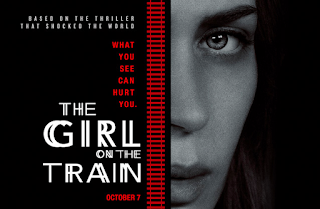
Thrillers often involve ransoms, captivities, heists and murders performed by psychotic or damaged individuals, and eventually a hero (who always seems to have flaws, and yet we love them despite of this) comes along and saves the day, and in classic thrillers sometimes rescue a damsel in distress on the way. In the 21st century, story lines have more or less developed so we have both men and women as the protagonist who saves the day, but it has to be said that in the end women are frequently still seen as the victim. Take The Girl on the Train (2016) starring Emily Blunt, an example of a recent thriller movie- the women are the flawed heroes, but in the end they are still the victims. Of course this is a key part of what makes the films so strong, the women all overcome the problems in their lives that have been caused by men, but it is true that is is still seen in many other films too. 

Thrillers aim to keep audiences of the edge of their seats in suspense, building up to a dramatic climax towards the end of the film. This in turn builds tension because as this is the principle for so many thrillers, audiences frequently expect a twist if the film is very slow-paced at the beginning. The most celebrated and iconic creator of the thriller is Alfred Hitchcock, who was famous for setting up normal-looking scenes, and then using a very slow-build to lead to a climax. He was the key founder of the thriller genre in the 1920s, and until the 1960s the genre was  dominated by his films, with classics like The Man Who Knew Too Much (1934), Rear Window (1954) and Psycho (1960). Since then the genre has broadened, and film-makers have looked to aspects of sub-genres of thrillers as inspiration for their films, like The Silence of the Lambs (1991), a psychological thriller based around the cannibalistic serial killer Hannibal Lecter, and Inception (2010), a sci-fi thriller looking at dreams and our perceptions of reality.

*http://www.screenonline.org.uk/film/id/444810/
assessed 18/10/2016

Thursday, 6 October 2016

Reflecting on our first practical task

For the last week in class we were tasked with creating a short film about a package being delivered to the school. As this idea was quite vague we had a lot off leeway when deciding how to film and edit the project, and what sort of tone we wanted to set. In our group of 4 we decided to use various locations around the school to show a coffee cup being delivered to someone in an office, which we had all agreed with by the end of our first session. By using a coffee cup we were able to have action sequences of people running down corridors, but also make it quite anticlimactic as in the end it's just a coffee.

Our filming started quite smoothly, even though we only had a vague idea of what we wanted to film as we all had a plan of the route we wanted to take around the school. However, we didn't do a storyboard as we only had a week's worth of lessons to get the project done. In the first couple of days I mainly did camera work, getting a feel for what the camera and the tripod could do, and I did some so-called 'acting' in front of the camera. 

Unfortunately, a few days into filming someone in our group lost our SD card which did set us back as we lost lots of footage, but when re-filming we had a much clearer idea of what we needed to shoot. I used the sound equipment a bit but not as much as I had hoped to, but this was again due to the time we had to film. We all shared the editing equally but only one person got to do the sound editing, so this is something I want to practice more in the future.

For future projects I know we're going to need much more time to plan and storyboard ideas, go to locations to see whether they are suitable to film, and I hope to also use the sound equipment and do sound editing more often.

Casino Royale opening- extended analytic essay


The opening of the first ‘James Bond’ film starring Daniel Craig, Casino Royale, is directed by Martin Campbell and aims to introduce the new Bond actor to an audience of newcomers and die-hard fans of the franchise. Campbell takes a more suspenseful approach to the opening than previous Bond films, using two different locations that juxtapose so we get a real sense of what Bond is capable of. This opening engages the audience through the use of black-and-white, and two different scenes that which cross-cut between each other using contrasting techniques of lighting, sound and camerawork.

Throughout the opening scene, the director decided not to use any colour, so the opening appears in black and white. This creates a very nostalgic feeling, as the director wanted the audience to be reminded of the old Bond movies. Even though they were never shot in black white, he director wants you to feel this will be more sentimental and true to the classic Bond films. The first part of the opening has very low-key lighting in the building, we can clearly see that it is night so there are limited light sources, and it adds to the mysterious nature of the scene. There are small spotlights in the corridor of the building that is covered in glass walls and metallic poles so the lights can be reflected off of the surfaces. In the office itself there is very little lighting, but there is some light shining into the office, showing the isolation of Bond and the villain in the room. As the scene is in black and white, it means that the chiaroscuro is very bold, so everything in the scene seems much more dark and dramatic. Both Bond and the villain have one side of their face in the light, implying secrecy and parts of themselves hidden from society. Lights are also shone on certain parts of the set such as the cupboard that the villain finds to have been opened and when the villain opens the draw at his desk with a gun in it, so these events are highlighted to the audience, therefore drawing in them in and building tension as we question why the cupboard is important and whether he will use the gun. When we cross cut to the scene at the cricket match, there is more natural, daytime, high-key lighting so it appears much brighter than the previous scene, symbolizing the naivety of the cricketers and spectators and the dark nature of Bond’s mission. There is a strong contrast in lighting between the two locations which helps separate the time differences, as the cricket scene is set in the recent past. When we see Bond for the first time at the match he is standing behind a structure at the back of the spectator area, separated from the other people in the light, which shows the danger and mysteriousness of his job. After the villain runs through the building behind the pitch he goes into a bathroom, lit with unflattering strip lights. As these strip lights are unnatural it makes the audience feel more uncomfortable and reflects the nature of this raw fight of hand-to-hand combat as opposed to a simple gunshot. The only bit of colour we see in this whole opening sequence is when the villain picks up his gun after nearly being drowned in an attempt to shoot Bond, to which Bond turns straight to the camera and points his gun at us like all the classic Bond film openings, and cartoon-like red blood wipes down the screen. Not only is this a great transition between this scene and the opening credits and serves as a classic reference to all of the previous Bond films, but the red is polysemic and therefore connotes many things such as danger, lust and power.

The editing in the opening of the film is quite simplistic, but much like the light and colour the differences in editing from scene to scene reflects the nature of the actions of the characters. All the cuts in this are straight cuts but the variation in speed is the main element of the editing: when Bond and the villain are in the office there are many low-speed, shot reverse-shot frames, reflecting the calm feeling of the scene, but also builds tension as this reserved feeling seems wrong if Bond is coming here to kill. When it cross-cuts to the cricket match the editing is still low-speed, again reflecting the relaxed, friendly match, but when the fight begins in the bathroom the editing is suddenly very high-speed, contrasting with slow-paced beginning, and mirrors the aggressive fight between Bond and the other villain. There are two jump-cuts in the opening, and one occurs when the villain in the bathroom picks up a bin as if he is about to hit Bond with it, and then the camera cross-cuts to the office, whizzes round and stops as the other villain pulls of his gun and points it at Bond. This provides a connection between the two kills as they are whom Bond needs to assassinate in order to become a ‘00’ agent. After he (nearly) drowns the villain in the bathroom, the editing changes back to low-speed, as Bond realises what he has just done and how he is now much closer to gaining his ‘00’ status.

The sound is very subtle in the first few shots, with barely-there single notes playing in the soundtrack underneath the diegetic sound of the car pulling up outside the building. When we see the lift ascending up the building we only hear the sound effects of the lift and afterwards the sound of the villain walking down the glass corridor, which builds tension as we question what will happen next as he is alone in the building at this moment. The composer uses ‘beats’ in the music to highlight important moments in the office scenes , such as the villain noticing his cupboard is empty resulting in him realizing Bond is in the room, and him pulling out the draw with the gun in it. As the scene progresses, strings are added to the music and there is a small crescendo before we switch to the cricket scene, which compliments the development of the storyline. In the cricket match scene there is no soundtrack, only diegetic sounds of players running on the pitch, applause and hitting cricket balls, which creates a more familiar, comfortable feeling for the audience. When the villain in this scene notices Bond standing in the spectator area, the non-diegetic music begins again, but with a more brassy instruments, and crescendos as the villain runs into the building, which all adds to the drama of the situation. The villain notices that Bond has followed him into the building, and the music momentarily stops on a loud note so the audience can see the villain’s reaction, and then the music continues but with a fast, regular tempo the reflects the action of the scene. Really dramatic, orchestral, brassy music is used when the fight ensues in the bathroom, and the non-diegetic sounds of huffing, shouting, punching and crashing are added on. The music stops again when we switch back to the office scene and we hear the villain take the gun out of the draw, and the soundtrack returns to high pitched, very quiet strings, but when we switch back to the fight the soundtrack goes back to the loud, intense accompaniment. When the villain cease to resist being drowned in the sink, the music stops and we hear him fall to the floor, and the sound effect of the water from the tap still running makes it seem anticlimactic. Upon cutting back to Bond in the dark office, atmospheric, non-orchestral deep sounds play underneath the dialogue, again juxtaposing the violent actions. Bond shoots the villain, and the sound effects are hyperbolic and accompanied by a short clip of brass instruments playing very loudly to add to the drama, and then the soundtrack immediately switches back to the high-pitched strings. This sound crescendos when we see Bond back in the bathroom, picking up his gun, and after the villain attempts to shoot Bond, he turns to the camera for the classic Bond opening shot and the title music begins. This song includes electric guitars and is much more modern compared to the previous Bond films, cementing Martin Campbell’s style in the Bond franchise.

The camera work in the opening sequence works with the editing format in that the office scenes are simplistic, steady and slow-paced, whereas the fight scene uses much shakier, hand-held camera work and is more intense and close up to the action. The opening shot establishes the location of the action; the car pulls up outside the building, and the following shot shows the villain of this scene getting out of the car, with the camera looking upwards towards him. Looking up at him, the audience assumes he is important, powerful and someone with high social status. However after another shot of the camera looking up in the glass building to ascending lift, we see another shot of the villain but the camera looks down on him in the lift. This may show that the environment around him, the career he has and his corrupt role in secret service may ultimately be his downfall. The rest of the office scene is shot quite simplistically: when the villain notices the cupboard is empty we see a close-up shot of him to shot his sudden fear and realization, and then a sudden change of focus reveals Bond to be sitting in a chair in the office. The camera follows the villain to his chair, and then the director chooses to have a long-shot of Bond and the villain in the office, barely lit, to show their distance from each other. We see a match-on action of the villain pulling out his draw which contains a gun, implying that he is scared or at least prepared to defend himself. The rest of this part of the scene up to the cricket match only uses the same long-shot of the two sitting away from each other, and shot reverse-shots of the two characters. As it is so subtle it makes us feel uncomfortable as we do not know what might happen next. In the cricket scene the opening shot establishes the location, with the spectators in the foreground and the field in the background. The villain is introduced with a close up shot of him look behind where he is sitting, building intimacy with the audience and showing that he is in danger. The camera cuts to a closed shot of Bond standing in the shadows, at which point the villain gets up to move into the building, and the camera operator follows him down corridors and through changing rooms eventually ending up in the bathroom. The audience feels as if we are getting let in on the action while we follow his route down the corridor. The fight begins with a shot of the villain holding his gun up towards a civilian and Bond follows him is through the door unexpectedly as he is out of focus. The director decided to use mainly match-on-action and close-up shots to capture each movement in the fight, for example, the camera follows hands when they reach to punch each other. The close-up shots of Bond shows the aggressive emotions he needs to have the strength to assassinate his target. Shots of the cubicle door closing in front of the camera and the aerial shot of the two crashing along the toilet doors feels like this is very secretive, and again like we are being let in to something that is kept away from society. To transition between the two scenes the director uses a match on action shot of the villain about to hit Bond with a bin, and then the camera whizzes and stops abruptly to see the villain in the office pull out his gun. We return back to the shot-reverse shot style of the office scene, calm and composed in juxtaposition to the previous fight scene. During the next section of the fight the camera looks up towards Bond and down at the villain, which shows the change in power from the previous scene and how Bond now has control of the situation. Close-up shots of Bond’s aggressive tension in his face while he tries to drown his target, accompanied with shots of the villain drowning in the sink make it very uncomfortable to watch. After the villain stops restraining, there is a mid-shot of him falling to the floor, followed by a long, suspended close-up on Bond, and we see his tension fade but the realization of what he has just done appears on his face. We return to the office scene, and to the shot reverse-shot close-ups, and when Bond shoots the villain in this scene the camera jump cuts past a photo of the villain’s family and then to a mid-shot of the villain falling back over his chair. The contrast between the nature of each assassination- violent drowning and immediate shooting- adds to the different atmosphere of each scene. The final shot of the opening sequence is of course the classic frame of Bond pointing the gun at the camera, and the lense that goes around the frame is edited in, like all the other classic Bond films.

The mise-en-scene in the opening sequence is certainly very different at each location, but it manages to retain a dark theme across the two. In the office scene we feel much more relaxed although it is more suspenseful as there isn’t much going on, even though it has a nighttime setting, whereas in the bathroom scene is more forward in showing the violence. The villain in the first scene turns out to be working as part of the secret service, but Bond states that he shouldn’t be ‘selling secrets’, implying that his work is corrupt. We know that his motive must be to get Bond out of the way of his work as he attempts to shoot him later, and doesn’t know that he is a valued member of the secret service because he is on his to get his ‘00’ license. We presume Bond’s motive is to assassinate the villain in the scene, as that is what the audience knows to be his usual motive for being in strange places. The villain suspects he was the agent who killed the man at the cricket match after Bond confirms that he is aware of the idea that it takes ‘two kills’ to become a ‘00’ agent, so the audience presumes that if he kills the villain in the office then he will get his promotion. Shooting the scene in black and white allowed the director to flip between the two locations, while creating a classic, iconic feeling to the opening. Always dressed in his suit to kill, we can clearly see that Bond’s job is of very high caliber, whereas the villain in the cricket scene is dressed casually, showing that he does not expect Bond’s appearance. Bond is a man of very little words, but the few words that he does say therefore become iconic. He speaks only with the intent of fulfilling his job and passing on information, so in the scenes where there is barely any dialogue the reader is easily drawn in, trying to see any subtle references or actions.


In conclusion, the film takes a new spin on the Bond franchise while still nodding to the original films. As an opening we have a clear introduction into Daniel Craig’s James Bond, his character and his morals, and it sets the tone for the rest of the film as more of a thriller than an action adventure, unlike the others previously made.